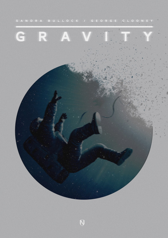
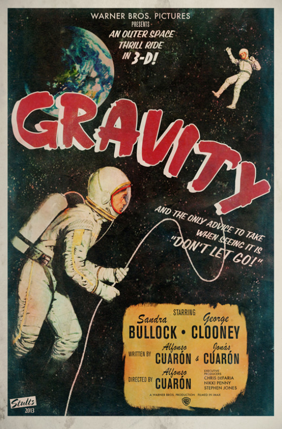
What happens when you ask a group of visually adept artists to design alternative movie posters for a blockbuster film like "Gravity"? Magic, that's what.
Thanks to the blog Short List, we've come across a treasure trove of artworks devoted to Sandra Bullock and George Clooney's epic of a space misadventure. From minimalist, monochromatic imaginings to throwback designs that harken back to vintage film posters, the collection of "Gravity"-inspired artworks are an appropriately heart-stopping visual feast.
Behold, how nine artists envision the Alfonso Cuaron masterpiece:
1. Matt Needle

2. Peter Stults

3. Tom Muller

4. Paul Jeffrey

5. Janée Meadows

6. Nizam Ali

7. Chris Thornley

8. Rachael Sinclair

9. Ben Whitesell

Thanks to the blog Short List, we've come across a treasure trove of artworks devoted to Sandra Bullock and George Clooney's epic of a space misadventure. From minimalist, monochromatic imaginings to throwback designs that harken back to vintage film posters, the collection of "Gravity"-inspired artworks are an appropriately heart-stopping visual feast.
Behold, how nine artists envision the Alfonso Cuaron masterpiece:
1. Matt Needle

2. Peter Stults

3. Tom Muller

4. Paul Jeffrey

5. Janée Meadows

6. Nizam Ali

7. Chris Thornley

8. Rachael Sinclair

9. Ben Whitesell

No comments:
Post a Comment